Wednesday 29 February 2012

Evaluation Question 1


MAGAZINE

* I used inspiration from the above 'Total Film' magazine when it came to having writing promoting the magazine and the information found inside it. 

* I took a colour influence from this magazine for the text although by doing research around horror films and audience feedback. I focused on making most of the text either black, white or red and Total Film focus' on red and white text in this example.

* The masthead is in the same position (at the top, filling the whole width) and is the largest text on the whole page to make it stand out and grab peoples attention.

* The title of the film is underneath the image on both. This makes it clear to the audience which film the title is representing.

* I have used the typical codes and conventions of a magazine such as a barcode, the price, a main image, the title of the magazine and tagline, the title of film and slugline, additional stories etc.


* I may have used the influence to have the writing going across the top but I've decided to use different colours. I feel as though having the 'Summer Blockbuster' in white makes it stand out more. 

* I have been more simplistic with the way in which I have presented my masthead compared to the 'Total Film' magazine. I've focused more on the image manipulation rather than with the text so that the focus isn't shifted. 

*Although I have copied the convention of having a slugline under the title of my film, I haven't used the same position and in addition mine isn't as large as the example shown. This is because I didn't want to draw the attention away from the title.

* I've used the convention of placing a bar code on the magazine cover but mine has been rotated to being portrait.

* Picture fills whole page but mine shows the two main characters instead of the one. This shows off my genre and narrative of film by doing so as apposed to if I would have just put a final girl image or an image of the villain.

* I have included a banner across the bottom to advertise the films inside. This isn't commonly used in film magazines, mainly music ones but I liked how it fitted in and the effect it gave my magazine last year. 

* I've purposefully not made my magazine cover very busy. I wanted all the focus, as mentioned previously, to be on the picture because I feel that it represents the narrative of my trailer really well.

* I have done a lot of image manipulation using my own inspiration to portray the right atmosphere so that my genre can be seen and also some of the narrative. In addition, I haven't done a seperate background for my main image because I have taken the location and photography into more consideration this year. 


POSTER

* I've used inspiration and used an image of Hannah's eye for the picture on the poster. I think having such a simple image works really well because it catches your attention really quickly. 

* The title on both my poster and the example I have given is the largest font. This is because I've copied the stereotypical codes and conventions and took the knowledge I'd learnt last year that the title should stand out clearly. 

* I've used the codes and conventions of a film poster also such as the steels tongs font at the bottom of the page which informs everyone of who's been involved with the production of the film. 

* I've included the website name in the same position as the example, underneath the steel tongs font. 

* You can tell from both posters what genre the film is that is being advertised by the overall making of the product. 


* I have used more variety with the colours. This is because I have used the stereotypical ones that people would associate horror films with which are black, white and red. In addition, I have based the magazine around these colours also. 

* I have used a different effect within the eye to tell the narrative better. I have put the villain into the victims eye to also make the poster look more effective and not as plain. 

* The title of the film is in the same place but mine isn't as bold as the examples, but is larger so that the effect of the font can be seen more clearly.

* The steel tongs font isn't as detailed and isn't in the same layout. 

* The website is bigger as the website being advertised on the example poster. 

* I have included a tagline on my poster. This is usually one of the most common codes and conventions of film posters and I think it looks really effective and lets the audience see a little more insight into what your film is about. 

* My poster is darker. I've added a black gradient around the edges to create a darker, horror-looking atmosphere to it to allow the audience see what kind of a film I'm trying to advertise. 

* I've used a landscape layout for my poster as I think that it was more suitable since I wanted the audience to be able to see the villain within the eye clearly and I don't think this would be as clear if it was a portrait portray alike the example. 

* I haven't added any of the actors' names onto my poster. I didn't want much writing on it alike my magazine so that the audience didn't get distracted. 

TRAILER

* I have included a MPAA message at the beginning of the film, to inform the audience. 

* The production logo has been included in the trailer at the beginning, after the MPAA message to advertise the specific company. 

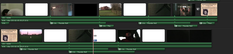
* I have used subtitles like most horror trailers to create suspense and get the tension building throughout. 

* The dark lighting and eerie sound which builds up as the trailer goes along also immediately signifies that a horror film is being advertised. 

* I've used a montage of different images at the end where everything gets really fast paced to draw the audience in. In addition. I've used Todorov's theory including peaks, equilibriums and including bits of the narrative. 

* I've got the classic villain and victim idea being shown.

* Fast editing has been used to build the pace which also shows the genre more clearly.  


* Although I have included both the production and distribution logo, they aren't shown straight after one another as expected. Mine has dialogue between which helps tell the story. 

* I have included the release at the end of the trailer but I haven't been as specific as the example I've used. I think that with my trailer 'Coming Soon' is more effective because its short and quick. 

* In the horror trailer example, there were short pieces of footage which consisted of high key lighting to represent the change in atmosphere. I have done this but I have still made the lighter scenes have either the 'day to night' effect or 'bleach bypass' effect to make them look more spooky. 

* I have used both a voice over and subtitles which isn't very common in most horror trailers, but I feel it works well in mine as it builds the tension up. 

* Usually you'd find the looking on the internet scene, in more psychological, paranormal horror film but I feel that it works in mine because it lets the audience no how unaware and shows the victims vulnerability.

* The sound gradually builds up and starts to have more impact, but it isn't as advanced as other trailers. 

* The mise-en-scene consists of some common and uncommon locations for example the woodland/forrest area is something you'd expect, where as the surgical room isn't commonly found in a lot of horror trailers that I have looked at. This links in with the story line.

* I have realized throughout the year that my trailer is a lot like 'Julia's Eyes' and 'The Eye' but I've developed the idea so that it targets people of a younger age because of the lead actress in it.


* In horror trailers, there's always the key hero where as in mine, the girl seems too vulnerable to be able to tell if she survives or not at the end of the film. 

* Challenge is a tough one for my trailer because I have used my research sensibly and almost taken influences from lots of different trailers and put them all as one.


Research And Planning : Everything Completed


Research and Planning: Voice Recordings For The Beginning

Wednesday 22 February 2012

Research and Planning: Trailer with added sound recordings

 
This trailer has the additional sound recordings in it. I have decided not to include the 'Seeing Is Believing' recording in it because I feel that it makes it seem more dramatic when you hear the voice later on.
There are a couple of things I still need to do. For example:
* I need to re-record the patient talking at the beginning, but I will do this when the media room is empty.
*I need to make a bang or boom to go at the end of the surgery scene when she opens her eyes.
* I need to add a darker effect/glow on the clips when I'm running outside to add tension to the clip.

Research and Planning: Sound Recordings

 
Today I got the sound recordings from Angela for me to use in my trailer. I will be putting these in my trailer to give it a more dramatic effect. She recorded: 'The Unseen, Coming Soon, Some people say seeing is believing' and 'But what if it's a curse?'

Tuesday 14 February 2012

Research and Planning: Trailer The Unseen

Today I went into college to sort out the majority of the footage. This is what I've got so far.

Research and Planning: Score so far

Today I created part of my score on garage band. I changed the pitch after I recorded different instruments to make them sound more distorted and overlapped them so that it sounded more effective. The basic breathing effect that lasts throughout is something I've taken because I can't find a way to recreate it yet.


Research and Planning: Newspaper mock up

For my trailer, I wanted to create a newspaper mock up which reports that Sophie Mars, the villain went missing. Hopefully this works well in my trailer montage.

Research and Planning: Audience feedback for magazine and poster


Some of the feedback from my magazine was:

* To adjust the alignment of writing at the top.
*To make the slug line more prominent.
* To make the stories at the bottom more prominent.
Some of the feedback that I got for my poster were: 

*To make the steel tongs less bold, therefore I changed the colour to a darker red and put a drop shadow on it.
* The logo's needed to be blended in more. Therefore I desaturated the logo's. 

Monday 13 February 2012

Research and Planning: Filming

Today I filmed some more of my footage today. I managed to get footage of:

*POV of me running with heavy breathing.
*POV long shot of my feet running
*POV shot of me watching someone from a bush.
*POV shot of me running trying to find help
*Me screaming.

Wednesday 8 February 2012

Research And Planning: Additional Filming

I took a video camera and a tripod home today so that I can start to film small extracts for my teaser trailer. I have just finished filming the mirror footage where the words 'Help Me' can be seen. Unfortunately this wasn't as strong or as bold as I thought it was going to be, but I think since it will only be seen for 0.2 seconds, it might look effective regardless.

I've also tried doing the knife part tonight, although this didn't work as well as I'd hoped either but I'll import the footage tomorrow and play around.

Research and Planning: More influences for montage

This post shows me researching more trailers to see what inspiration I can find for the shots for my teaser trailer.

 
This shows examples of the montage effect I was trying to create.


I like the newspaper footage in this trailer. I'm sure whether I would do it like this, but it's given me a clearer idea.

Research and Planning: Shot list for montage

Here are some of the ideas that I am thinking of using for my trailer for the montage towards the end of my trailer. I've been trying to think of things I could shoot at home so that it's easier for me.

*I want writing on the mirror. I will shoot this at home on our mirror, that way I can shoot it really easily. I will use red lipstick for the effect.
*I want a small piece of footage of someone holding a knife. This will be an extreme close up, and it doesn't matter who's holding it because I will use an effect on iMovie where it blacks out the finer detail.
*I want to have a shot of someone running and this will be filmed as a POV. This also can be done at home.
*I think that the idea of a newspaper mock up would be a good idea. This is something Angela thought of. I will create this on Photoshop and will be a basic newspaper report saying that the villain has gone missing.

Tuesday 7 February 2012

Research And Planning: Trailer influence

Here is the main influence I have for the montage at the end of my trailer. When the action begins, it has flashes from the film but from different locations, and that's the atmosphere I want to create because I feel it's really effective.

Research And Planning: Update to trailer

I am now going to change the ending of my trailer. After speaking to Angela, I agree with her feedback that the end of the trailer seems like its setting a location again and it doesn't get to that final stage where it shocks everyone. The beginning is fine, it sets the narrative and then we're introduced to the main character a bit in different scenes but there's no final push to shock people. As a result of this, I'm going to shoot some more footage/take individual pictures for a montage effect towards the end to build up the tension. This may be difficult though since Angela is busy for the rest of the week, then it's half term. I will have to start planning what ideas I could have.

Monday 6 February 2012

Research and Planning: Editing Log


Research and Planning: Plan for the week

Today I had a word with Angela about my progress and she said to focus on my trailer from now on because my magazine and poster is practically finished.

*I need to tidy up the end car scene.
* I also need to have some more discussions and ideas about the sound and score to make it more effective.
*I need to upload my editing log so far

Wednesday 1 February 2012

Research And Planning: Sound Influences


I love the talking effect in this trailer, but I don't feel that it is appropriate for mine. On the other hand, there's more non-diegetic sound in the background that I really find effective.


Although I do think that this music is effective, I feel that it may be a bit too dark for my trailer.

I love the trailer score. Esspecially when it gets to about 1 minute, because I love how it builds gradually. I chose to look at this trailer since it's very similar to the genre and narrative of my trailer.

Research And Planning: Plan For The Week

Today Angela sat down with me and spoke about my blog. She said the following and these points are what I'm going to work on the best I can this week:

TRAILER: 

* I need to start working more on the sound. She said she's going to get a voice over of someone saying 'The Unseen' and 'Coming Soon' for the trailer also which may give it a bigger impact.
* I need to tidy up some of the editing in the middle of the trailer.
* I need to find a way of getting the idea that she's had an eye operation over to the audience.

POSTER: 

* I need to increase the size of everything since it looks like all the text is used mainly around the edges, so by increasing the text size and image, it may make it group together better.
* The steel tongs information at the bottom looks too short, so I need to add some extra bits to it.
* I need to add my distribution company and my production company logo at the bottom.
* I still need to add the website address underneath the steel tongs information.

MAGAZINE: 

* I need to tidy up the inside story part at the bottom of the magazine. I'll use the guides to sort that out.